
Changelog
Follow up on the latest improvements and updates.
RSS
We're pleased to announce the launch of additional customization options for your dashboards in Insights. This update gives you greater flexibility to modify the aesthetic of your dashboards beyond the default Flyer color scheme.
What's New:
- Expanded Color Schemes:Choose from a wider array of pre-selected color options to better align with your brand or personal preference. 🌈
Explore these new features and select the customization options that best suit your needs and those of your team. Happy customizing! 🚀
We're thrilled to announce the rollout of a much-anticipated feature: Favorites ❤️. This addition is all about making your data dashboard experience more personalized 🙌, efficient 🚀, and in tune with your everyday needs 📊.
What's New? 🌟
- Favorites Marking Capability:You can now easily mark your most-used Looks or dashboards as favorites. A couple of clicks lets you add or remove items from your favorites for quick access 👆.
- Personalized Dashboard Management:Your favorites are stored at an individual user level, ensuring a tailored experience according to each person's account and preferences 🎯.
- Convenient Access:A 'Favorites' folder is now integrated directly into the side navigation, allowing instant access to your go-to reports and dashboards 📁.
Why Favorites? 💡
You asked, we listened! Your feedback revealed a need for quicker and easier access to frequently used dashboards. Favorites are one solution, designed to streamline your workflow and save precious time ⏳.
Getting Started 🚀
Explore this new feature today! Click the 3 dots more icon in the side nav next to your dashboards and reports to begin building your Favorites list. We can't wait to hear what you think!
We're always listening to your feedback and looking for ways to improve how you and your team interact with
Insights
. Many of you have shared how crucial it is to streamline communication and access to data across various stakeholders within your organization—whether they're reviewing performance data via scheduled dashboards or directly in the app.In alignment with our commitment to making data accessibility as seamless as possible, we're thrilled to announce a new enhancement to our "Schedule Delivery" feature!
🚀 What's New?
Now, when you schedule a dashboard to be delivered via email, you can add an actionable hyperlink. Just one click and you're taken directly to the live content within
Insights
. This not only saves time but also enriches your ability to interact with the data more deeply, directly in the app.This feature is perfect for stakeholders who prefer receiving updates through email but also want the flexibility to explore data further in the app whenever necessary.
📚 Updated Documentation
We’ve updated our documentation to help you make the most out of this new feature. You can find the updated guides on scheduling and sending dashboards with clickable links here.
🎬 Get Started Now!
To integrate clickable links into your workflow:
-
Existing Schedules:
Update your schedule settings by following the guided video below:- New Schedules:Set up your new schedules with clickable hyperlinks using our step-by-step video guide here:
We hope this update makes your data interaction even more intuitive and effective. As always, we value your feedback and look forward to hearing how these changes help improve your data communication and decision-making processes.
new
Insights
🏠 Customize Your 'Home' page in Insights!
👋 Hello Insights Community!
Ever wished you could start your day in
Insights
with the dashboard that matters most to you? Now you can!✨ Why You'll Love This Update:
- Direct Access to What Matters:Choose your most important dashboard as your starting point inInsights.
- Simplified Customization:Easily set and change your "Home" dashboard with just a few clicks.
🚀 Quick Start Guide:
- Go to your favorite dashboard or report.
- Hit the "more" icon in the side menu.
- Click "Set as Home".
- Start enjoying Insights, your way!
💡 We're Not Stopping Here!
We developed this feature based on your valuable feedback 💬, aiming to make your interaction with Insights more efficient and personalized. Tell us how this update improves your daily interaction—we're all ears and always evolving!
improved
Insights
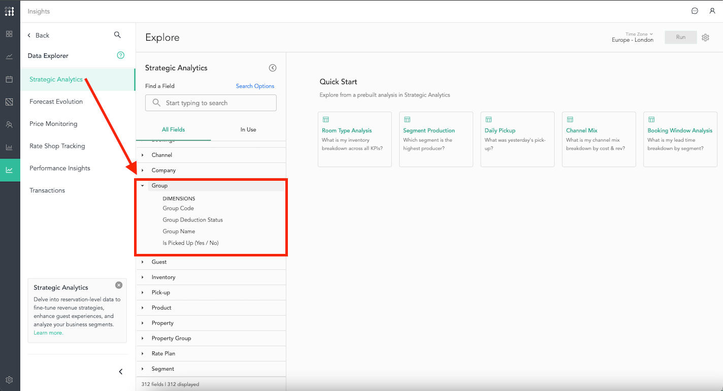
Enhanced Group Block Status Clarity in 'Insights' 🔄
In our ongoing mission to streamline and enhance your data analysis experience, we're rolling out some updates to the
Strategic Analytics
Explore, specifically targeting the clarity of group block statuses. This change is rooted in our commitment to making data analytics as accessible and intuitive as possible for all users.Key Updates:
Simplified Naming Convention 📛:
To eliminate confusion and improve user experience, we've updated the names and descriptions of fields related to group block status. This ensures consistency and eases the interpretation of data across different Property Management Systems (PMS).
Renamed Fields for Enhanced Clarity 🔄:
- "Group Status" is now "Group Deduction Status":This change aims to more accurately reflect the status of group blocks, whether they are deducted from inventory or not.
- "Definite" to "Deduct":To clarify that these groups are confirmed and thus deducted from available inventory.
- "Tentative" to "Non-Deduct":Making it clearer that these groups have not been deducted from inventory.
- "Is Group Block (Yes/No)" to "Is Picked Up (Yes/No)":This update simplifies understanding whether the units or revenue within a group block have been picked up or not.
We believe these updates will significantly improve the way you interact with group block data, aiding in more efficient and effective analysis. This change is a direct result of your feedback and our dedication to continuously improving your analytics experience.
Thank you for your ongoing support and partnership. We're excited to see how these updates will further empower your decision-making processes! 🚀
improved
new
Insights
📈 Refining Forecast Accuracy with APE 📈
In the hospitality industry, where strategic planning and operational efficiency hinge on the accuracy of forecasts, FLYR for Hospitality is dedicated to offering the most advanced tools for our users. We're proud to incorporate Absolute Percentage Error (APE) into our forecasting toolkit 🛠️, enhancing your ability to assess and refine forecast accuracy like never before.
🎯 Introducing Absolute Percentage Error (APE)
Absolute Percentage Error is a crucial metric for evaluating the precision of forecasts by comparing the actual outcomes with predicted values. By offering a percentage-based measure of accuracy, APE simplifies the assessment of forecast performance for entire stay months, aligning perfectly with the monthly forecasting workflow prevalent in the industry.
💡 Dual Forecasts at FLYR for Hospitality: System and User Forecasts
FLYR for Hospitality provides two types of forecasts:
System Forecasts
, which leverage our data science intelligence 🧠 for automated predictions, and User Forecasts
, derived from user inputs within the Planning
product. With the introduction of APE, we're excited to offer the capability to critique the accuracy of these forecasts both individually and in comparison with each other, empowering users with unparalleled insight into their forecasting strategies.🚀 Getting Started with APE
FLYR for Hospitality has developed two specialized dashboards to facilitate in-depth analysis at the property level for an individual month, focusing on key performance indicators: Occupancy, ADR (Average Daily Rate), and Revenue. These dashboards enable users to leverage APE for comprehensive forecast analysis:
- System vs. User Forecast Accuracy Dashboard:Compare user-generated and system forecasts, observing the evolution of each to provide a comprehensive view of forecast performance. This dashboard is your go-to for evaluating how user inputs stack up against our data science-driven predictions, allowing for a direct comparison of forecasting accuracy.
- Property-Level User Forecasting Assessment:This dashboard is specifically designed to assess the user forecast, offering insights into the overall forecast evolution and the performance of each segment within the month. It's an invaluable tool for users looking to dive deep into their own forecasting process, from the broader monthly overview down to the segment-level analysis.
Both dashboards are crafted to support detailed analyses at the property level for an individual month across each KPI 📊, enabling users to make informed decisions and strategic adjustments based on accurate, data-driven insights.
📚 Support and Resources
To help you maximize the benefits of APE in your forecasting efforts, FLYR for Hospitality provides a comprehensive suite of support resources. From a tutorial that guides you through each dashboard to FAQs designed to answer your pressing questions, we're committed to ensuring you have the knowledge and tools needed to effectively utilize APE.
new
Insights
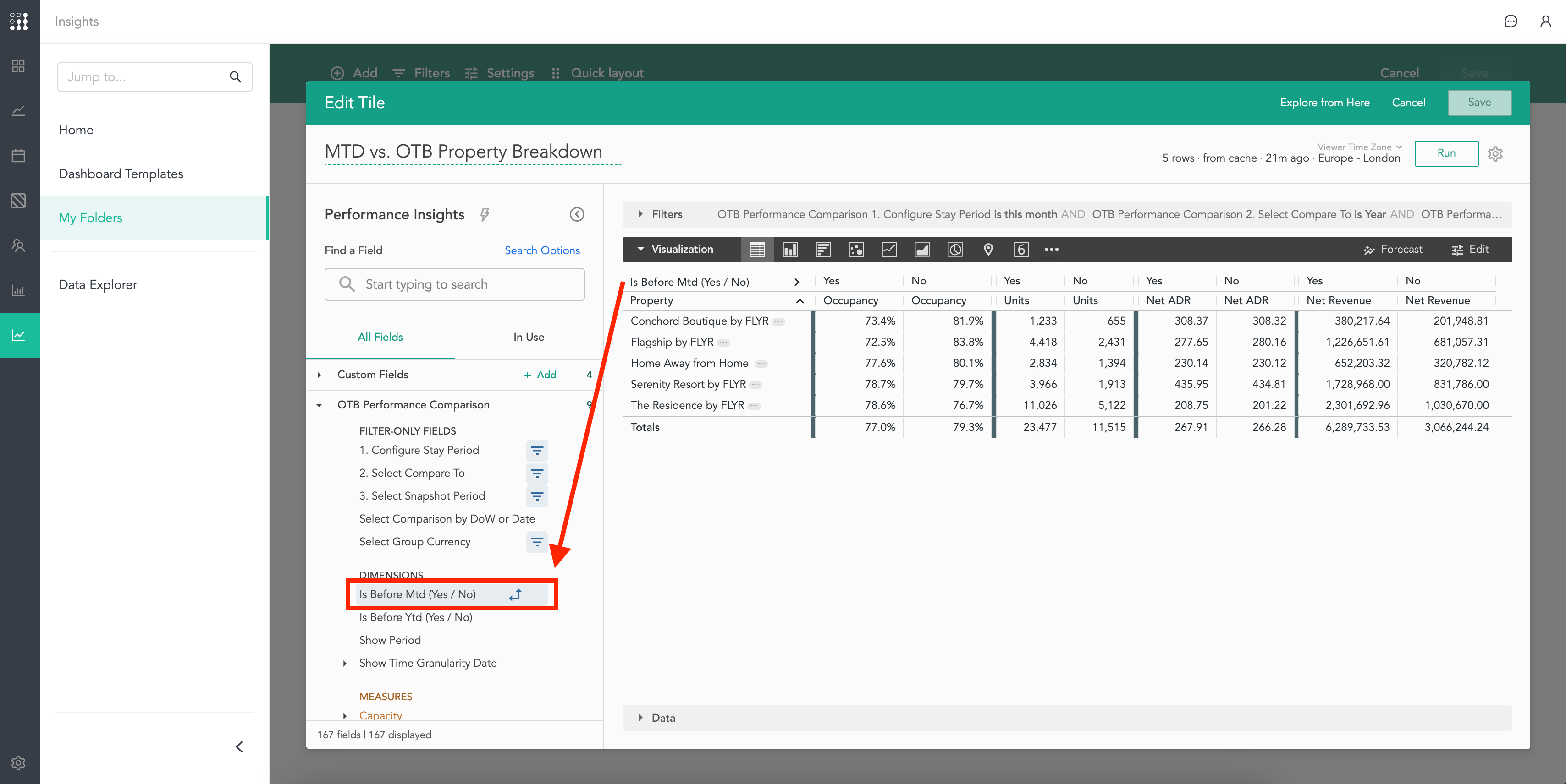
MTD Dimension Added to Insights 📊
We've heard your requests and are excited to deliver the Month-to-Date (MTD) dimension for
OTB Performance Comparison
. This update extends the MTD data visualization from just the Bookings field to include OTB Performance Comparison
across both Performance Insights
and Strategic Analytics
Explores.Key Updates:
- MTD Boolean Functionality ✅:MTD data is now accessible in the OTB Performance Comparison, alongside the existing YTD dimension
- Enhanced Analysis 📈:Leverage MTD for precise period-over-period comparisons, empowering you with the insights to make data-driven decisions quickly.
This addition, shaped by your feedback, aims to provide the tools you need for more nuanced performance tracking and analysis.
Thank you for helping us improve
Insights
! 🙏
new
Insights
📣 Operations Report Now Available!
Hello
Insights
community! We're excited to introduce a brand new dashboard template—
Operations Report
—designed to streamline your hotel management tasks even further.📍
Location
You'll find this new template in the
Performance Folder
within Insights
.📈
What’s Inside
This report includes both On-the-Books (OTB) and forecasted metrics for
arrivals, departures, and stayovers
, enabling you to make more informed staffing and operational decisions.👉 View the Operations Report HERE
new
Pricing
Insights
Integrations
HQ Revenue Integration Now Available! 🚀
We're excited to announce that we've completed the integration with HQ Revenue! 🎉
Now you can connect your HQ revenue account to FLYR for Hospitality and easily access all your Rate Shopping data right where you need it more! 💪
🤩
What can you do with it?
- 🔍 Compare the rates of your competitors with each one of your rooms directly in the Market Rates tab from the Pricing Quick View.
- 📈 Get the most out of your data in Insights using the Compset Pricing Dashboard or the Rate Shops Tracking explore to create custom visualisations.
⚙️
How to set it up?
- Reach out to your HQ revenue contact using this email template.
- Send us the list of Property IDs from HQ revenue over the chat on the FLYR for Hospitality app.
- Done! As soon as we start receiving data from HQ revenue it will show up in your FLYR for Hospitality account automatically. 😉
Thank you for being an integral part of this journey! 🙏 We can't wait to hear your feedback and continue to drive our commitment to continuous improvement.
If you have any questions or need help, please don't hesitate to reach out to our Support team. 💬
We are thrilled to announce a significant enhancement to your
Insights
experience. You've asked for it, and we've listened. We've now incorporated STR Historical Benchmarking Indexes into Insights
, with more STR data, including competitive set and segment data, coming shortly. 📈. Note: this complimentary integration is included with all active Smith Travel Research (STR) agreements. Set-up instructions are included below.
What to Expect:
- Informed Decision-Making:Access historical benchmarking data to make well-informed decisions about your properties and portfolios. 🏨
- Groundbreaking Portfolio-Level Dashboard: Experience benchmarking redefined with our new dashboard. Analyze your portfolio's history with unmatched depth in area and brand performance. 📊
- Custom Reports and Dashboards:Create tailored leveraging our entire data library including transactional-level reservations data, forecasting, budgeting, pricing and rate shopping data, putting the focus on the data that matters most to you. 📝
- Granular Time Analysis:Conduct detailed analysis over any selected time range, with the option to compare against a variety of periods such as the previous week, quarter, month, year, and more, for tailored insights and trend discovery. 📊
🎥 Video Walkthrough:
Important Note:
Please note that this integration specifically includes STR Historical Index data. We're actively working on bringing you more STR data, including competitive set and segment data, in the near future. 📅
Next Steps:
To activate this integration and start using STR Index data in
Insights
, please follow these instructions. 👇- Use this email template to reach out to data@str.com.
- Sign STR's data sharing agreement
- Send the list of STR Property IDs provided by STR via the chat on the FLYR for Hospitality App
__________________________________________________________________________________________________
Thank you for being a part of our
Insights
community. Your feedback and requests drive our commitment to continuous improvement. We can't wait for you to start exploring the platform with STR Index data. 🙌📞 If you have any questions or need assistance, please don't hesitate to reach out to our support team.
Load More
→